O3 World hosted an Accessibility (A11y) Design Slam as part of this year’s Philly Tech Week (September 21 – 25, 2020). The participants came together to address the question, “How might we make the airport experience more accessible to everyone, including individuals with a variety of disabilities?”
Earlier this year, O3 World held an internal Accessibility Design Slam focused on reimagining the grocery store shopping experience. We leveraged learnings from our internal event and used it as a launch pad to collaborate with the Philly Tech Week community. Individuals were randomly selected from various disciplines to work together to create and present a concept to a team of judges.
The Prompt
The airport is a source of frustration for individuals without a disability, so we can imagine how challenging it must be for individuals with a disability that are traveling. Identify key problems about the current experience, ideate on a single solution that your team deems the most critical, and formulate a solution that helps solve this challenge with accessibility in mind.
For the purpose of this exercise, we challenged teams to come up with a single solution that positively impacts everybody. We also asked the teams to focus on any experience within the building of an airport. In addition, teams were informed that the airport would be fully accessible from the exterior; i.e. with curb cuts, elevators, and large door entrances.
While the groups were free to explore the prompt in whatever way made sense to them, we provided a framework to help guide them through a series of design thinking exercises.
Rose, Thorn, Bud
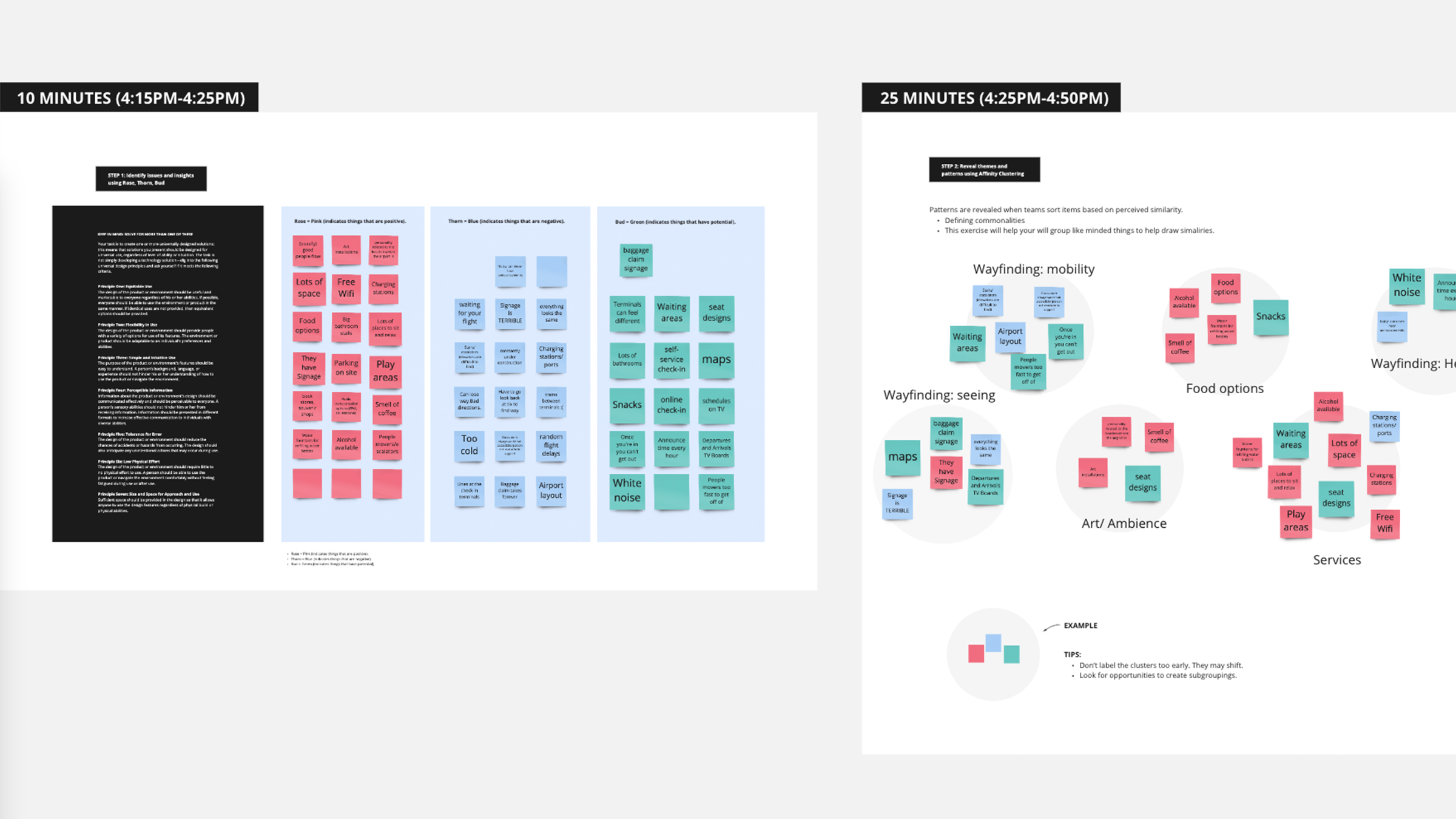
The goal of the Rose, Thorn, Bud exercise is to identify things as positive, negative, or having potential. This allows teams to ideate on pain points and opportunities to improve the experience of people traveling through an airport.
Affinity Clustering / Voting
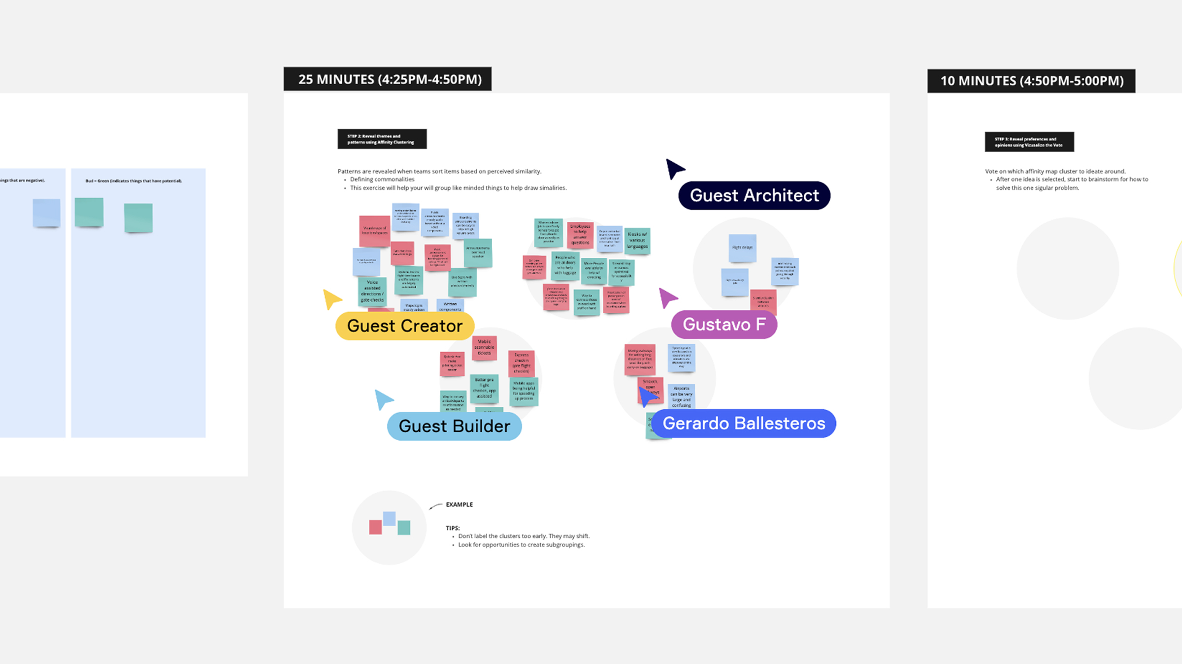
Building upon the output from the Rose, Thorn, Bud exercise, we asked participants to group their thoughts into affinity clusters, or ideas that are thematically similar. This helped each team group related ideas and the vote on a focus area for further refinement.
Concept Sketching
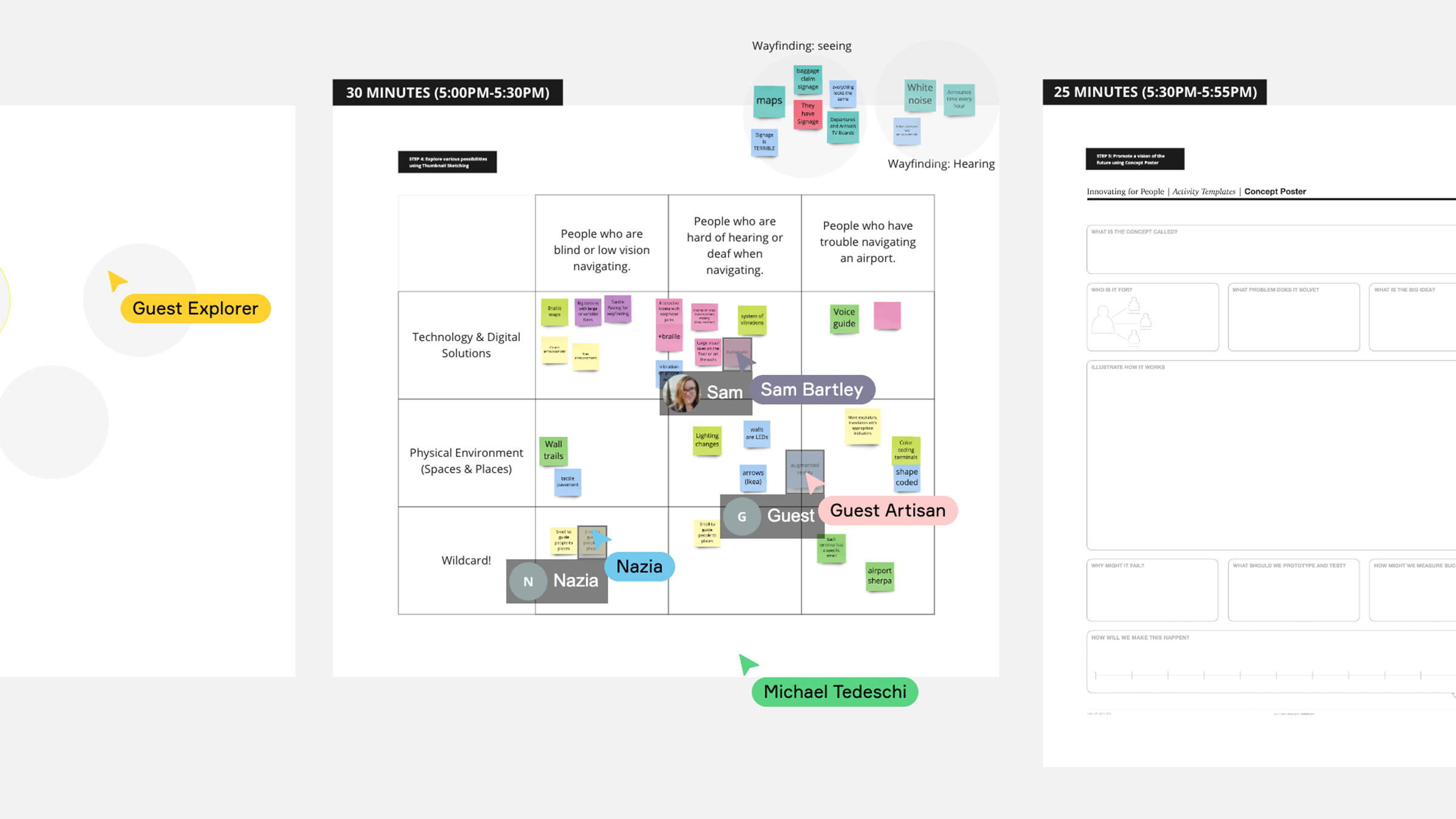
After each team pinpointed the problem they were looking to solve, they moved on to thumbnail sketching. This technique enabled them to craft a series of small drawings to quickly illustrate concepts and create alignment in their groups for the final solution to bring forward into judging.
Concept Poster
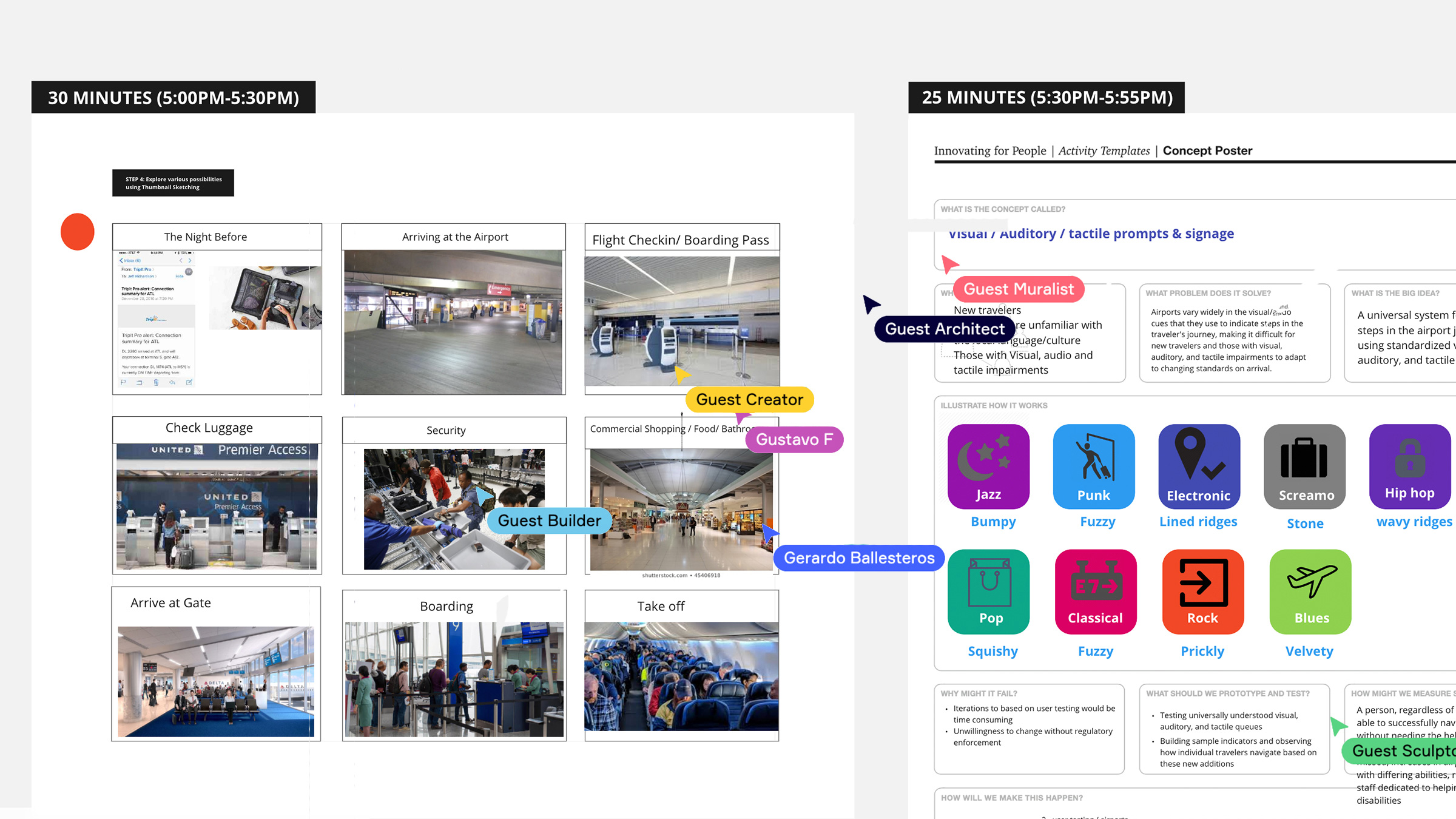
The final exercise asked each team to articulate the purpose and features of their concept along with key considerations like cost, time, and implementation tactics. This format helped ensure that each team considered the real world scenarios of bringing a product into reality so that judges could evaluate their solutions accordingly.
Our Panel of Judges
We were fortunate to enlist the help of three outside judges from the A11y community:
- Suzanne Erb (Accessibility Advisor for Networks for Training and Development)
- Ryan Dudek (UX Tech Lead at EY Design Studio PHL)
- Alex Umstead (Product Manager, Accessibility at Comcast)
Each brought their unique experiences and accessibility knowledge to review the presentations and to select a winning team. Once each team presented, we had our judges individually evaluate them based on the following criteria:
- Creativity: Is the solution inventive, innovative or creative?
- Feasibility: Is the solution feasible and practical?
- Accessibility: Is the solution accessible to a range of disabilities?
- Inclusivity: Is the solution taking a universal design approach?
The Solutions
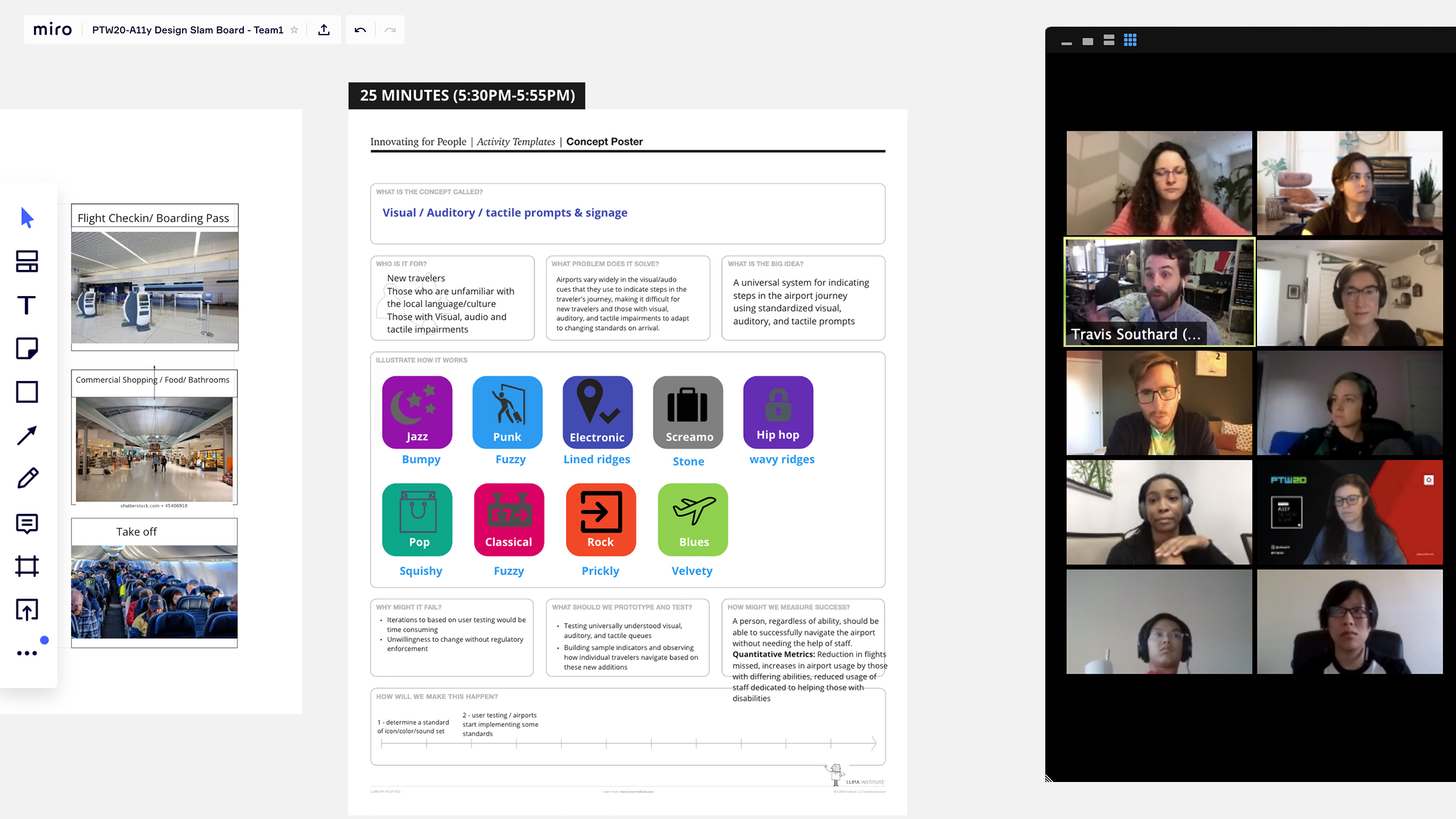
The first team created a concept that weaved together visual, auditory, and tactile prompts and signage. Their concept allowed both new and existing travelers to navigate through different areas of the airport experience. Their concept involved visual and audio cues to indicate steps in the traveler’s journey, making it a more uniform experience for new travelers and those with visual, auditory, and tactile impairments to adapt to changing standards on arrival. Imagine a universal way of speaking about signage, such as the roads we drive on today. This solution aimed to universally adopt principles that all airports could adopt and implement for a universal way of navigating.
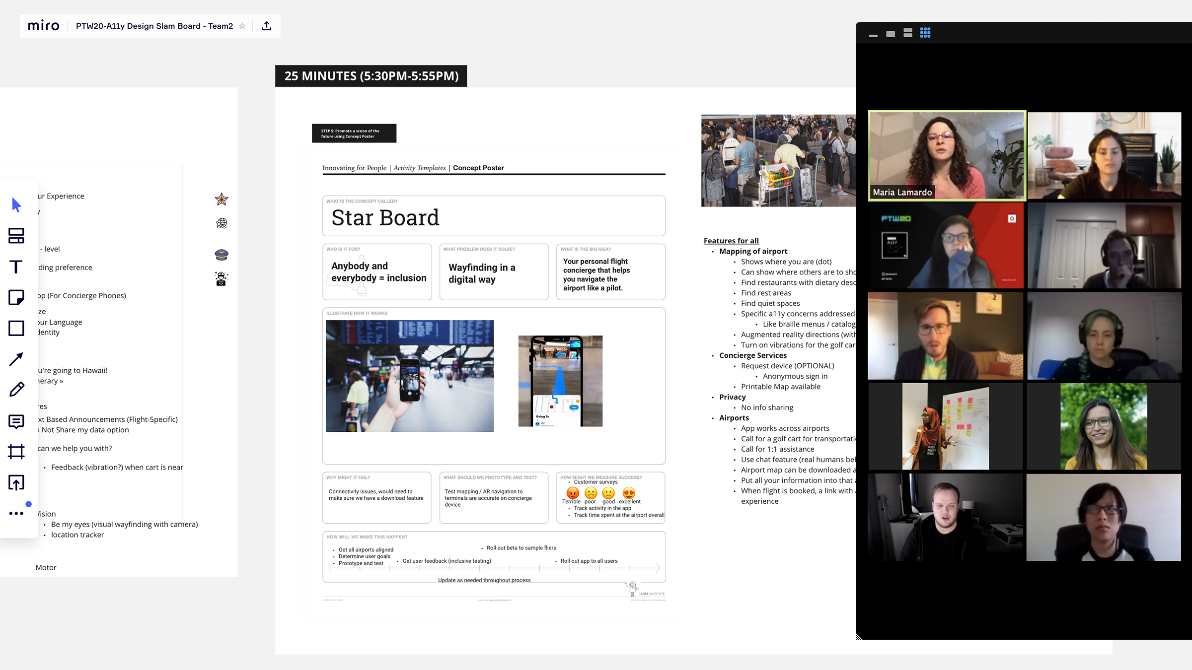
The second team created Star Board, a digital wayfinding application that’s inclusive for all, regardless of disability. Their big idea was that this was a personal flight concierge that would help users navigate the airport like a pilot. Imagine an app that could show you where you are, where your departure gate is, and find restrooms and restaurants with ease. Key features include the app working across airports, individualized experiences based on their device settings, and airport maps available for download prior to their arrival. The biggest selling point was that if a smartphone wasn’t available, the application could be accessible via tablets that the airport would provide ahead of time.
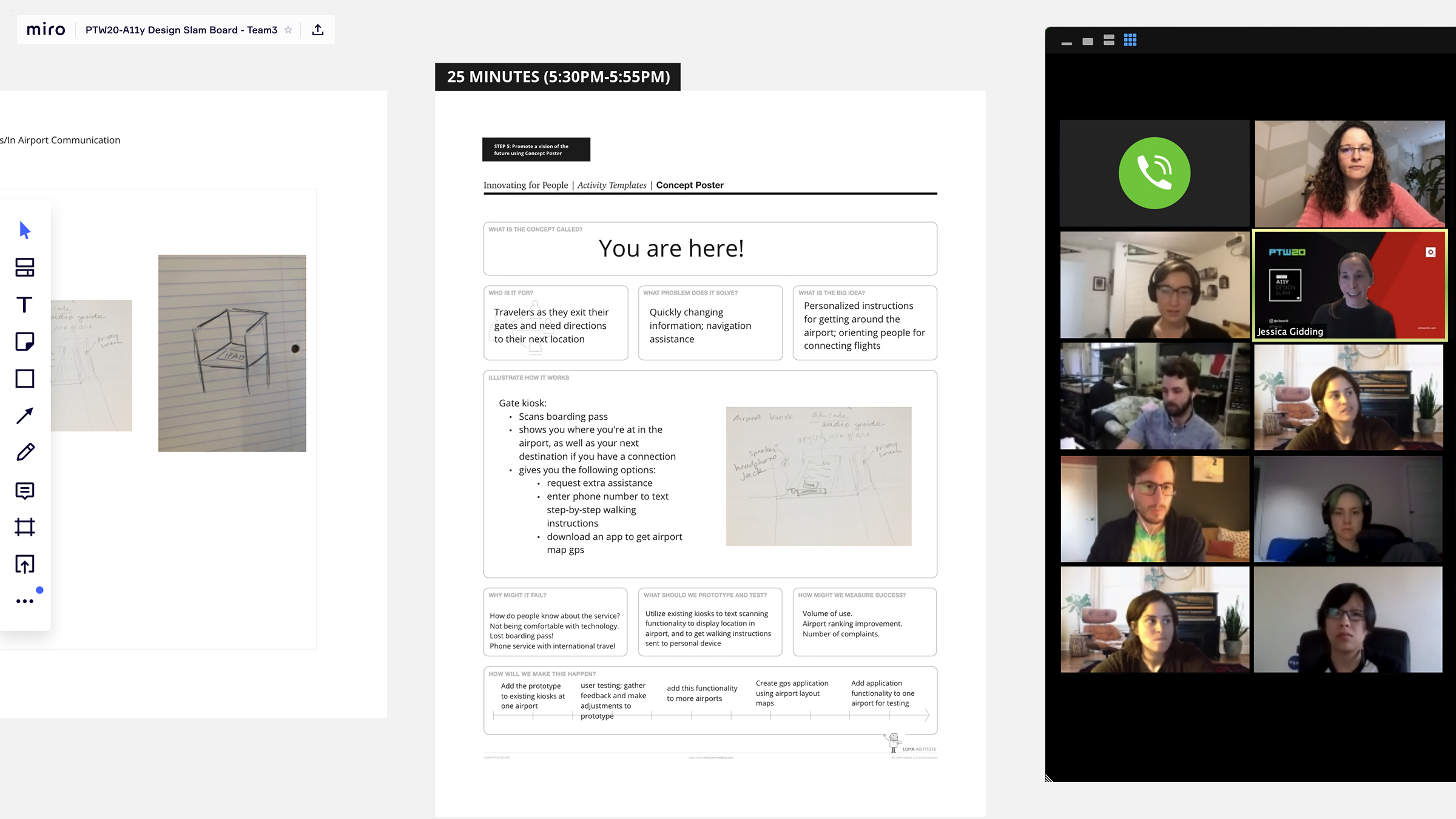
The third team created a similar idea to team two, entitled You Are Here. Their concept was based on a similar model of wayfinding as if a user needed to look up directions to their favorite department store at a mall. They would implement a solution similar to a kiosk system that allows users to digitally find their way around an airport. This kiosk system scans boarding passes, shows patrons where they are in the airport, and directs to the next destination of choice. Leveraging existing technology and infrastructure, this idea allows people to find their way, regardless of where they were in their airport journey. The kiosks would enable users to text personalized step-by-step walking directions and maps to an individual’s phone.
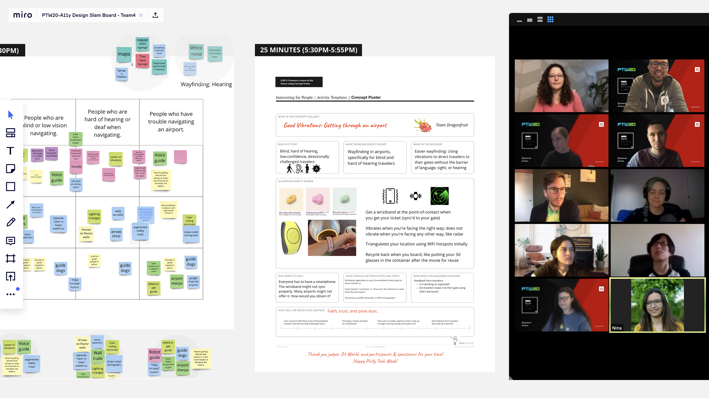
The final team presented Good Vibrations, which main focus was to help passengers get to their departure gate. This product is similar to the wristbands guests receive at Disney Parks. The bands provide haptic responses to help users navigate through an airport. When a person enters an airport and receives a boarding pass, they would also get a wristband that is synced with their departure gate. The product was designed to vibrate when a user faces the right way and does not vibrate when the user faces the wrong direction of a desired destination by triangulating their location using WiFi hotspots. When travelers board their flight, they would simply recycle it, like putting a pair of 3D glasses in the container after a movie for reuse.
The Winning Team
While there were various innovative ideas presented, there could only be one winner. It came down to Team Two and Team Three, however the judges felt that Team Two’s application Star Board was the winner. The judges had a healthy debate, but ultimately judge Suzanne Erb said it best:
“Team Two’s idea was the most accessible and provides a service to users that have their own devices.”
While most teams took vastly different approaches, the prompt was designed to explore all aspects of the airport experience and to help the teams think about the challenges when designing a product. Team Two’s solution was best aligned with the prompt to create a universally designed solution that allowed users – regardless of ability – to use the product to better enhance their airport experience.
What Comes Next?
Collectively, all attendees learned something new and gained insight into the world of digital accessibility. O3 World believes this Design Slam was just a start. Exercises like this are invaluable to starting the conversation about the challenges faced by individuals with disabilities and the important role that proactively thinking about accessibility and inclusivity has in the work we all do.
At O3 World we look forward to hosting more A11y Design Slams in the future! If you or folks you know are interested in participating, sign up for our Newsletter below for the next O3 event.
O3 helps organizations unlock growth and streamline operations through smart strategy, human-centered design, and integrated technology. We’re also the force behind the 1682 Conference, where leaders explore how AI shapes profit and process. Learn more about our work and innovation.
