Accessibility design slam
Strategists from all disciplines answered the question, “How might we make the grocery shopping experience more accessible to everyone, including individuals with various disabilities?” during O3’s annual Design Slam event.
The O3 team recently gathered for a Design Slam, which is a fun challenge that allows participants to flex their design, strategy and presentation muscles. It’s a creative problem-solving competition that consists of groups from various disciplines working together to solve a real-world problem.
Last year, we held a design slam focused on reimagining the ATM experience. Learning from last year’s design slam, we decided to center this year’s challenge around accessibility. We upped the ante and required that all concepts apply universal design principles to help improve experiences for individuals with disabilities.
Our design slam introduced four design thinking exercises to help each team collaborate. If you’re envisioning a designer’s version of “Chopped” you’re on the right track. We gave each team the same ingredients to create something spectacular.
Our Prompt
With universal principles of design in mind, how might we make the grocery shopping experience more accessible to everyone, including individuals with various disabilities? This could be how the store is designed (from the layout of the store to the arrangement of the shelves), to assistive technologies within the store, or any other ideas the teams could imagine. For the purpose of this exercise, we challenged teams to come up with a single solution that greatly impacts all. We also asked the teams to focus on what they could change inside the store, assuming the grocery store is fully accessible outside with curb cuts, handicap spaces and large door entrances.
While the groups were free to explore the prompt in whatever way made sense to them, we provided a framework to help guide them through a series of design thinking exercises.
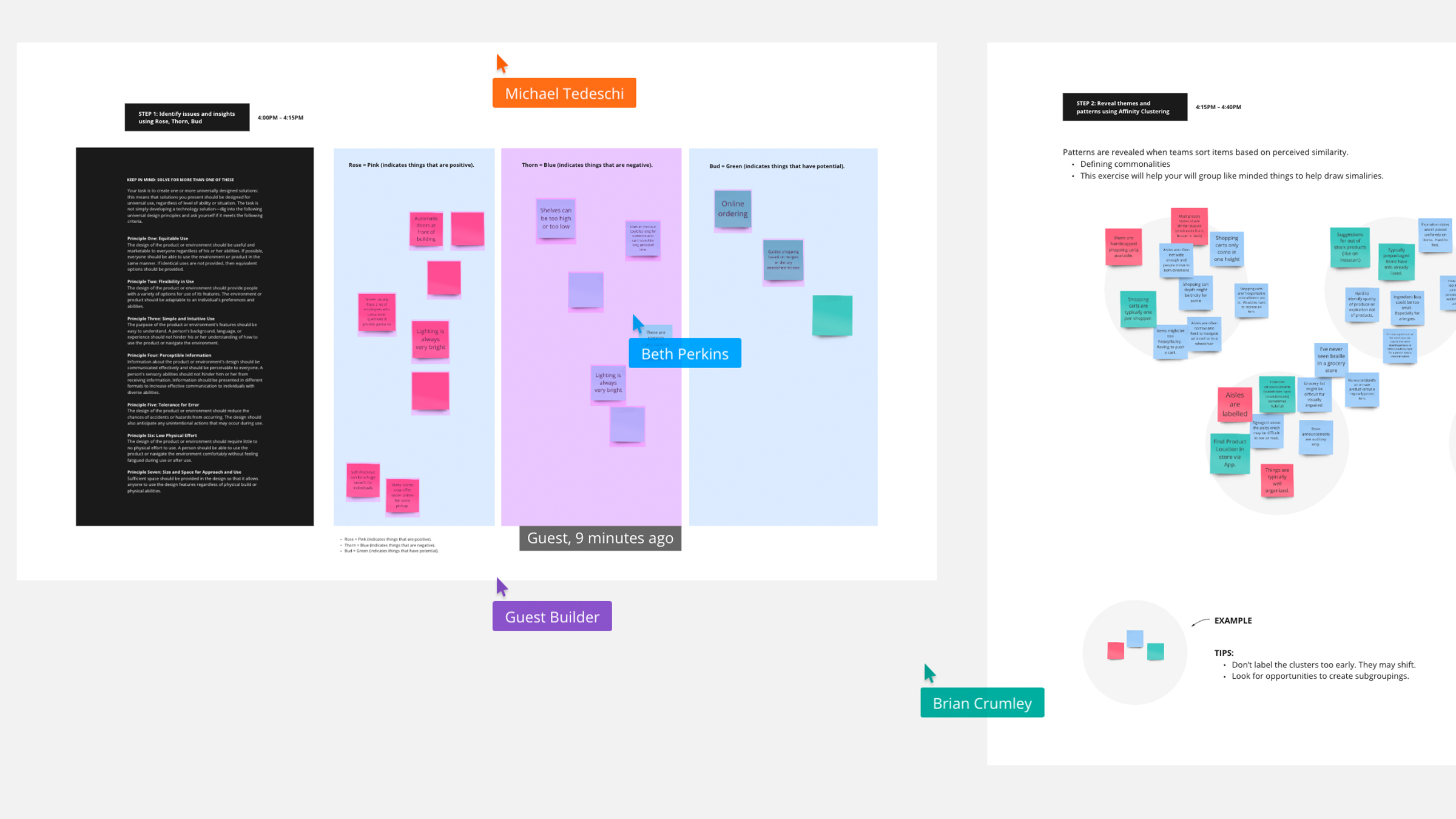
Rose, Thorn, Bud
The goal of the Rose, Thorn, Bud exercise is to identify things as positive, negative, or having potential. This allows teams to ideate on pain points and opportunities to improve the experience of people in the grocery store.
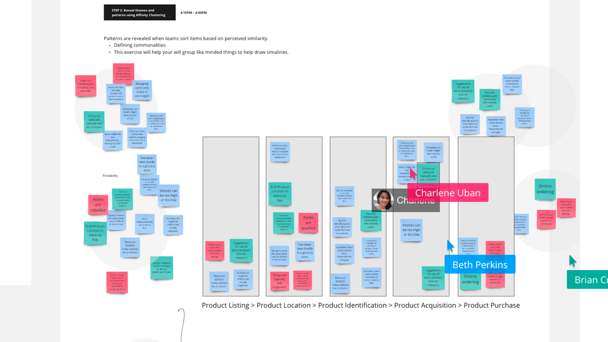
Affinity Clustering & Voting
Building upon the output from the Rose, Thorn, Bud exercise, we asked participants to group their thoughts into affinity clusters, or ideas that are thematically similar. This helped each team group like-minded ideas and vote to pick an area to focus on to further refine.
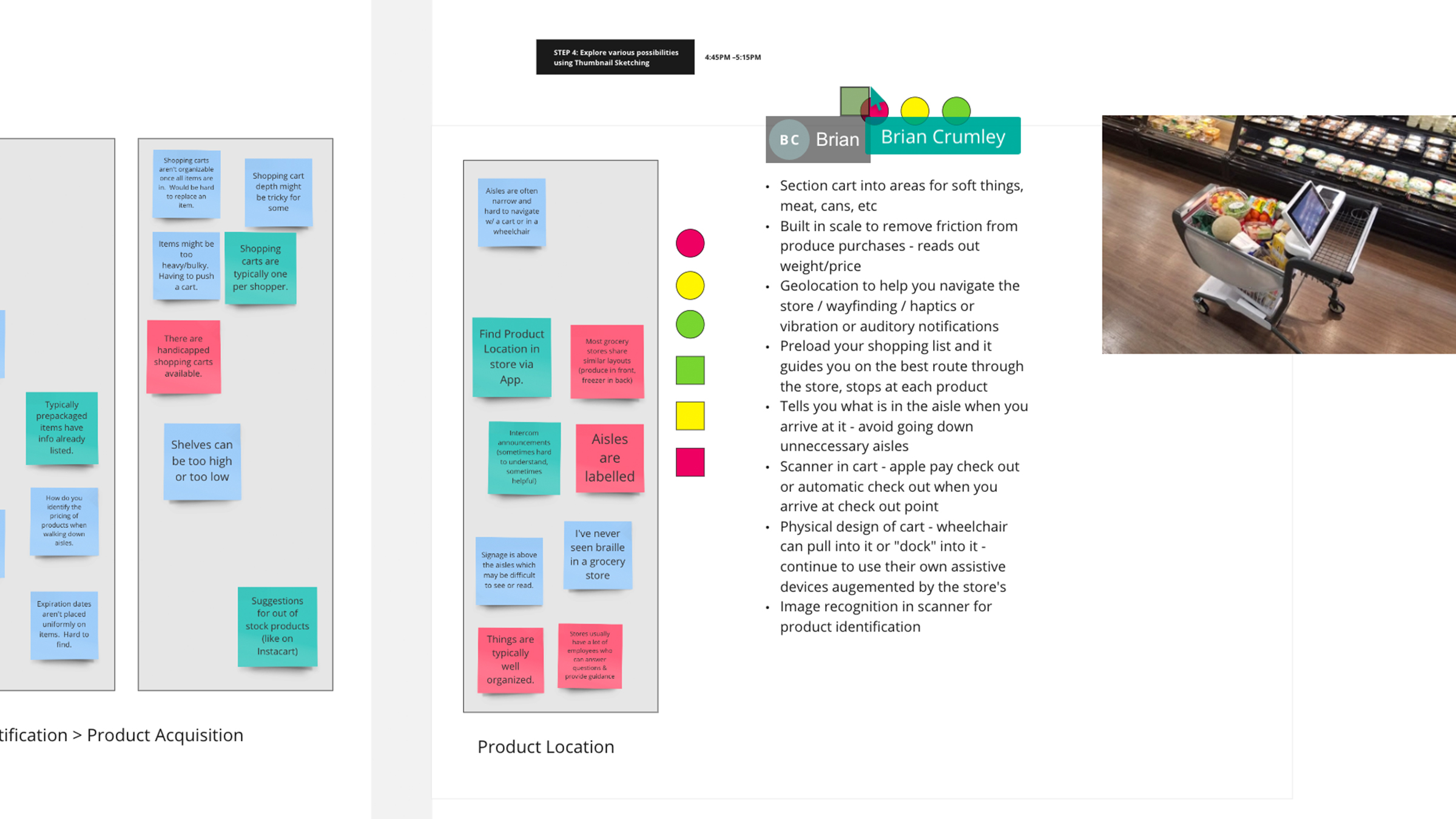
Concept Sketching
After each team pinpointed a problem to solve for, they moved on to thumbnail sketching. This technique enabled them to craft a series of small drawings to quickly illustrate potential concepts and create alignment in their groups for the final solution to present to the judges.
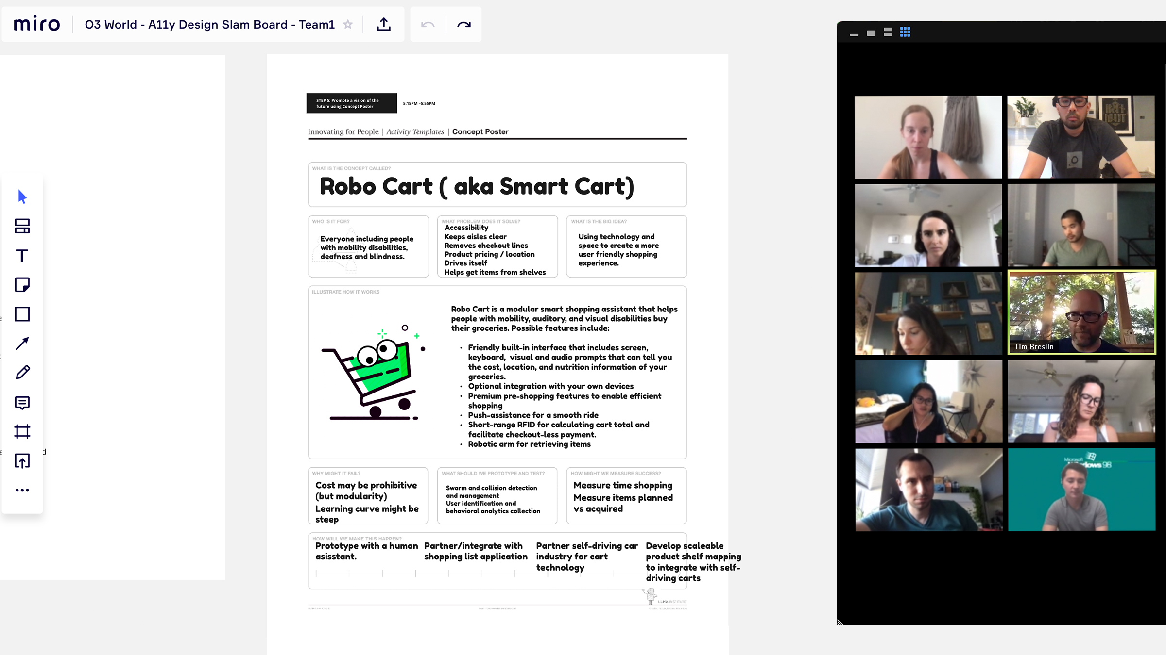
Concept Poster
The final exercise asked each team to articulate the purpose and features of their concept along with key things to consider like cost, time and limitations. This format helped ensure that each team was considering all major ideas in their presentation so we could focus on judging each idea on a level playing field.
Our Panel of Judges
We were fortunate to enlist the help of several judges, both internal to O3 and in our community: Suzanne Erb (Accessibility Advisor for Networks for Training and Development), Isabella Gong (Full Stack Developer and Accessibility Evangelist), and Jessica Gidding (Lead Engineer at O3 World and Certified Professional in Accessibility Core Competencies) to bring their accessibility knowledge to the forefront and select a winning team. Once each team presented, we had our judges score each team based on the following criteria: (on a scale from 1-10, with 10 being the highest.)
- Creativity: Is the solution inventive, innovative or creative?
- Feasibility: Is the solution feasible and practical?
- Accessibility: Is the solution accessible to a range of disabilities?
- Inclusivity: Is the solution taking a universal design approach?
Our Solutions
There were some trends among the solutions created, each with their own positives and pitfalls.
The first team created Robo Cart, a modular shopping cart assistant to help people buy groceries. The Robo Cart includes a variety of assistive technologies to help shoppers of varying abilities, such as a motorized set of wheels to power the cart. The Robo Cart also featured an easy-to-use screen to direct users around the store and enter their grocery list, allowing for each store wayfinding and navigation to find particular items, a common pain point for individuals who are blind or have limited vision. While the judges enjoyed the practicality of the concept, there were a number of questions about the logistics of this Robo Cart, including how it’d be charged and maintained, how to prevent theft and how it’d accommodate someone with a motor or physical disability.
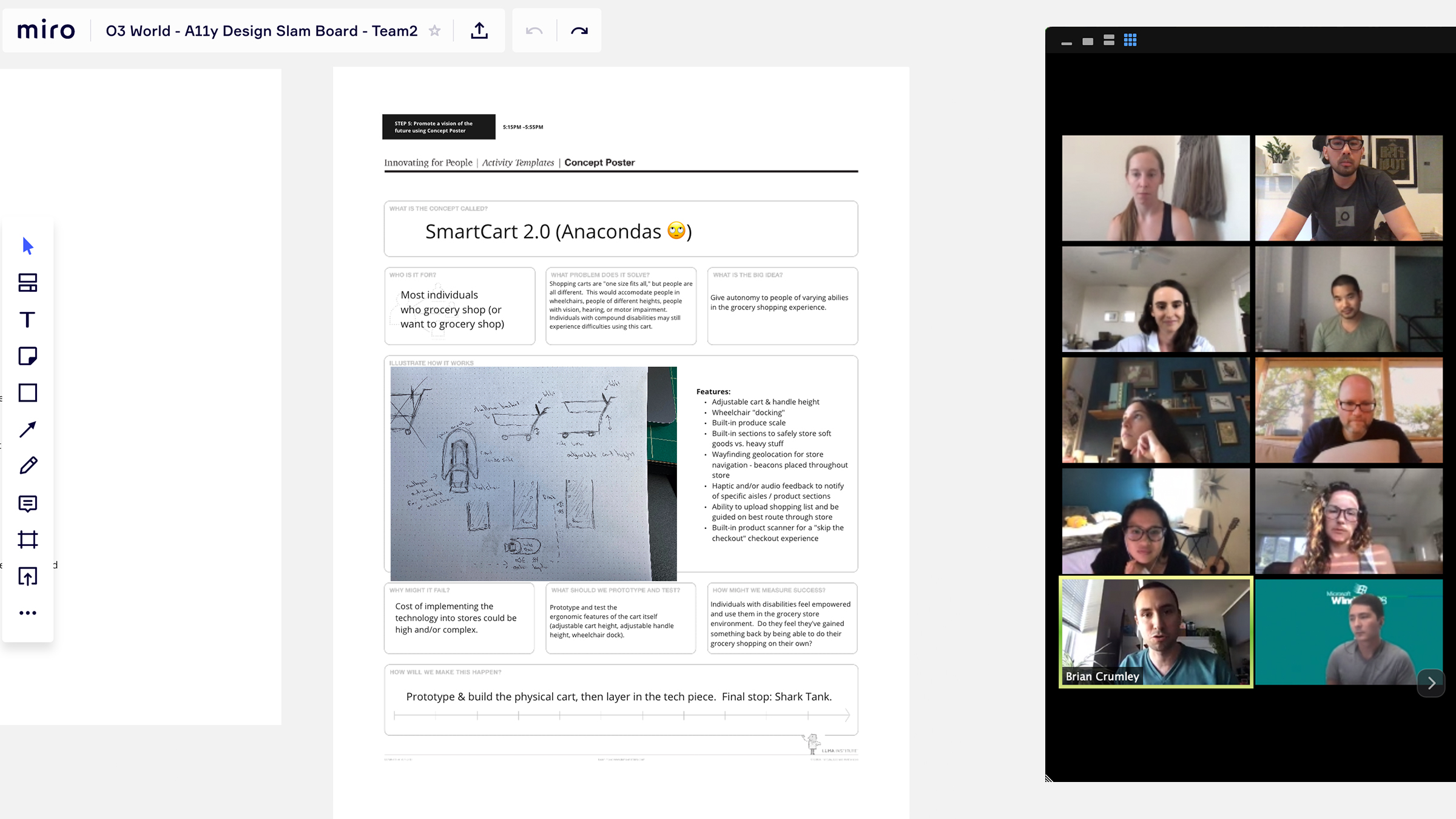
The second team also created a smart shopping cart, the SmartCart 2.0, to address the ergonomic issues of the traditional shopping cart. With some similar concepts to the Robo Cart, such as in-store wayfinding using geolocation for store navigation using beacons, there were some additional features: adjustable shopping cart height, a basket that is more shallow for easier reach, and improved design for better use with a wheelchair. The cart also featured a built in scale and product scanner. The judges appreciated the accommodations for individuals who use a wheelchair, but questioned ease of access to the various compartments in the cart itself.
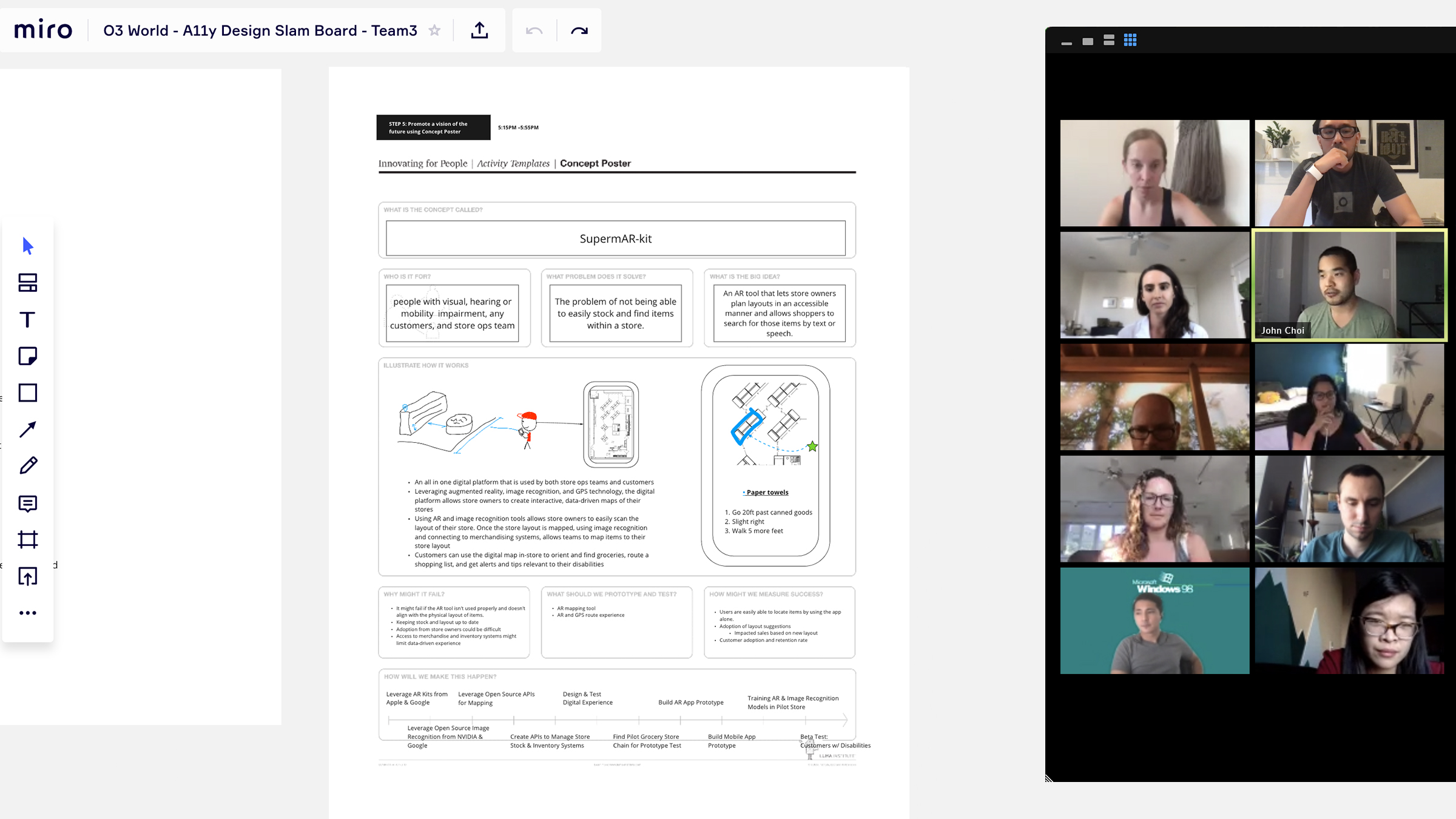
The final team went in a completely different direction by creating an AR application for people with hearing, visual, or motor impairments, called SupermAR-kit. SupermAR-kit is a digital platform for grocery store operations teams and customers that leverages augmented reality, image recognition and GPS to create interactive maps of stores. The goal is to solve the problem of not being able to easily stock and find items within a store, using existing technology to make it more feasible and accessible to grocery stores. Employees can also use the app to identify their specialties, such as the languages they speak. This feature was created to better assist customers in the store find employees that they can easily communicate with. For example, the app will notify customers as to which register to visit for help from an employee with similar language skills.
Our Winner
There could only be one winner and by unanimous decision, the judges felt that Team 3’s SupermAR-kit augmented reality app reigned supreme. The solution was best aligned with the prompt to create a universally designed solution, so the use of existing technology and tools that each individual has with them made this concept most feasible and accessible to all.
Suzanne Erb commented, “It’s really useful for everyone, regardless of disability or not. Because you’re using your own device, it’s actually possible to implement and scale it.”
Collectively, we all learned something new and gained a new perspective into the world of solving for accessibility, creating an environment to help coworkers learn to work together digitally, and to how to better ourselves when designing for accessibility in the real world.
O3 helps organizations unlock growth and streamline operations through smart strategy, human-centered design, and integrated technology. We’re also the force behind the 1682 Conference, where leaders explore how AI shapes profit and process. Learn more about our work and innovation.
